Continuing from here.
+ + +
Today I'll begin commenting on the materials I reliably use in my reading instruction. These aren't necessarily the only things that I use; I have some other stuff that I pull out from time to time just to shake things up. There are a lot of literacy toys and tools out there. But these are the core materials without which the rest of my series won't make much sense.
Item 1. A set of 44 large phoneme cards (not just an alphabet, as you'll see). Optional feature: Tactile letters.
Here are the basic features of these first cards:
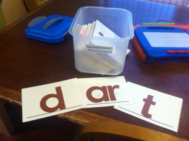
- They are large and fairly stiff (made of better-quality 5×7 cards).
- There is a horizontal base line along the bottom edge, to help a child keep them right-side-up.
- The letters are drawn with broad strokes, a fingertip's breadth.
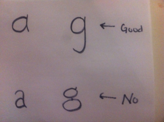
- You can use any manuscript style or font (D'Nealian, Zaner-Bloser, Century Gothic, whatever) you like, with one caveat:
And one not-basic, optional feature:
- My set is made of a textured paper cut into letter shapes and affixed with spray adhesive to the cards. The idea here is to make homemade "sandpaper letters" (they are a Montessori-school thing) that the child can trace with his finger, in order to get a little more sensory input for the kinetic/tactile learners.
- Further notes on the making of these cards: You can buy sandpaper letters, but generally not including digraphs; that's why I made my own. I do not think the texture is necessary for learning to read and recognize the letters; it's just a bonus feature. An easier way to get a similar benefit is to buy a separate set of sandpaper letters, and use them along with the large phoneme cards. Here is an affordable set of sandpaper letters made of cardboard.
- If you go the make-your-own-tactile-cards route, do not bother with actual sandpaper! It is very hard to cut into letter-shapes. Textured paper will work fine and, unlike sandpaper, can be cut with scissors. Honestly, I don't think the texture needs to be that pronounced; the letters just ought to be raised and rougher than the card they're pasted on. Construction paper is probably sufficient. If I were doing it today, I'd try to find a nappy-sort of textured paper that would fit in my printer. But I did it years ago when I had a little more time to spend on projects, and so mine are made from a pebbly scrapbook paper which I cut out around templates I printed from a word processor.
Cards in this set:
| a | b | c | d | e | f | g | h | i |
| j | k | l | m | n | o | p | qu | r |
| s | t | u | v | w | x | y | z | |
| er | sh | ai | th | ee | ng | ch | ar | ew |
| oy | ie | ck | oe | oo | ou | or | ue |
*N.B. I don't know what kind of font you're seeing, but caution on the cards that have an "a" or a "g." Look up at the photo!
Here's the concept that underlies this particular set of cards: Each card can be matched to one of 43 English phonemes. So, at the earliest stage of teaching decoding, I can pretend that English makes some sense. I save the bad news about English for later.
There is one additional phoneme — too important to leave out — which requires me to reuse just one card. Who wants to be the first to deduce which card has to do double duty?
More materials coming up.

